Where to put testimonials on your MSP website
The pages buyers actually read before they get in touch, which quote belongs on each, and why the testimonials page is the last place to put your best one
 6 min read
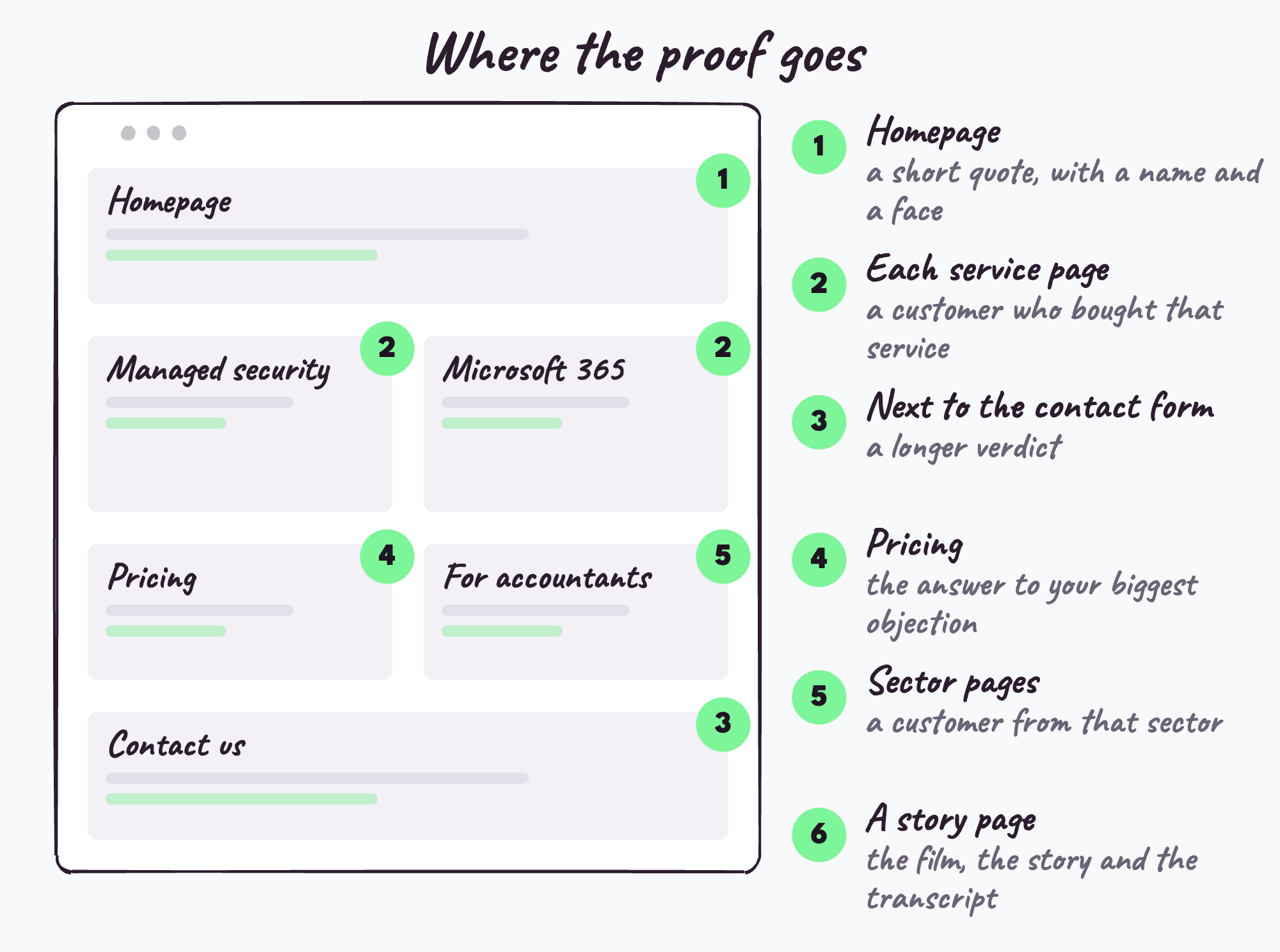
Put testimonials where buyers make decisions rather than on a testimonials page. On an MSP website the places that matter most are each service page, with a customer who bought that service, next to the contact form, the homepage, the pricing or "how we work" page, and any sector pages. Every quote should carry the customer's name, role and company, and match the question that page is answering.
Most MSPs who have testimonials have the same problem, and it isn't a shortage. The quotes exist, somebody collected them, and they live together on a page called Testimonials or Our Clients, one after another, like a guest book. Meanwhile the pages where buyers actually decide whether to get in touch carry nothing but the MSP's own description of itself.
So the question isn't really whether to have proof on your website. It's which pages, which quote on each, and what it looks like when it's done properly.
The rule that makes every placement work
Match the proof to the question the page is answering. A visitor on your cyber security page is asking whether you're any good at cyber security for a business like theirs. A visitor on your contact page is asking whether it's worth the hassle of filling in the form. A general quote about how friendly your helpdesk is answers neither.
Taking that seriously changes how you think about your testimonials. Each one stops being a single thing to display and becomes a set of pieces, each with a home. Cheryl Kearney's story for Urban Network has a line about the phone system, a line about how her staff took the move, a line about why she chose them and a verdict, and those belong on four different pages.
1. Each service page
This is the most valuable placement on your site and the most often empty. Somebody reading your managed security page or your Microsoft 365 page has a specific need, and a customer who bought that exact service, describing what changed, is the most relevant evidence you can put in front of them.
Use your own navigation as the list. If a service has its own item in your menu, it deserves its own customer story, and if you have a service page with no customer on it, that's the gap to fill next.
It matters for search too. When Promptwatch looked at what ChatGPT cited in July 2026, product and service pages were the largest category, at 32.8% of classified citations. The page that convinces the human is also the page AI answers read.
2. Next to the contact form
This is where the most motivated visitor on your site is having their last moment of doubt. They've read enough to consider getting in touch, and they're weighing up whether it's worth the sales call that follows.
Put a longer verdict here, something from the end of the story: what the customer would tell a peer who was deciding. A line about how easy the move was also works well, because the fear at this moment is disruption.
3. The homepage
A short one, near the top, from a customer a visitor might recognise or identify with, with the person's name, role, company and ideally a photo or logo. The homepage's job is to say "real businesses like yours use us", quickly, so keep the quote short and let the rest of the page do the explaining.
4. The pricing or "how we work" page
People on a pricing page are asking whether you're worth it. The best quote here is one that addresses value or the objection that stalls most of your deals, whether that's "we already have someone" or "moving IT is too disruptive".
The monthly service charge, yeah, it's not tiny, but it's also not massive.
That's the kind of line that belongs here, because it answers a worry most buyers have but won't say out loud.
5. Sector pages
If you have pages for the industries you serve, legal, accountancy, healthcare, construction, each one needs a customer from that industry. A buyer on your page for accountants who meets a quote from a manufacturer learns that you don't have many accountants.
If you don't have sector pages yet, a customer story is a good reason to create one: the story gives the page something real to say.
6. A page for the full story
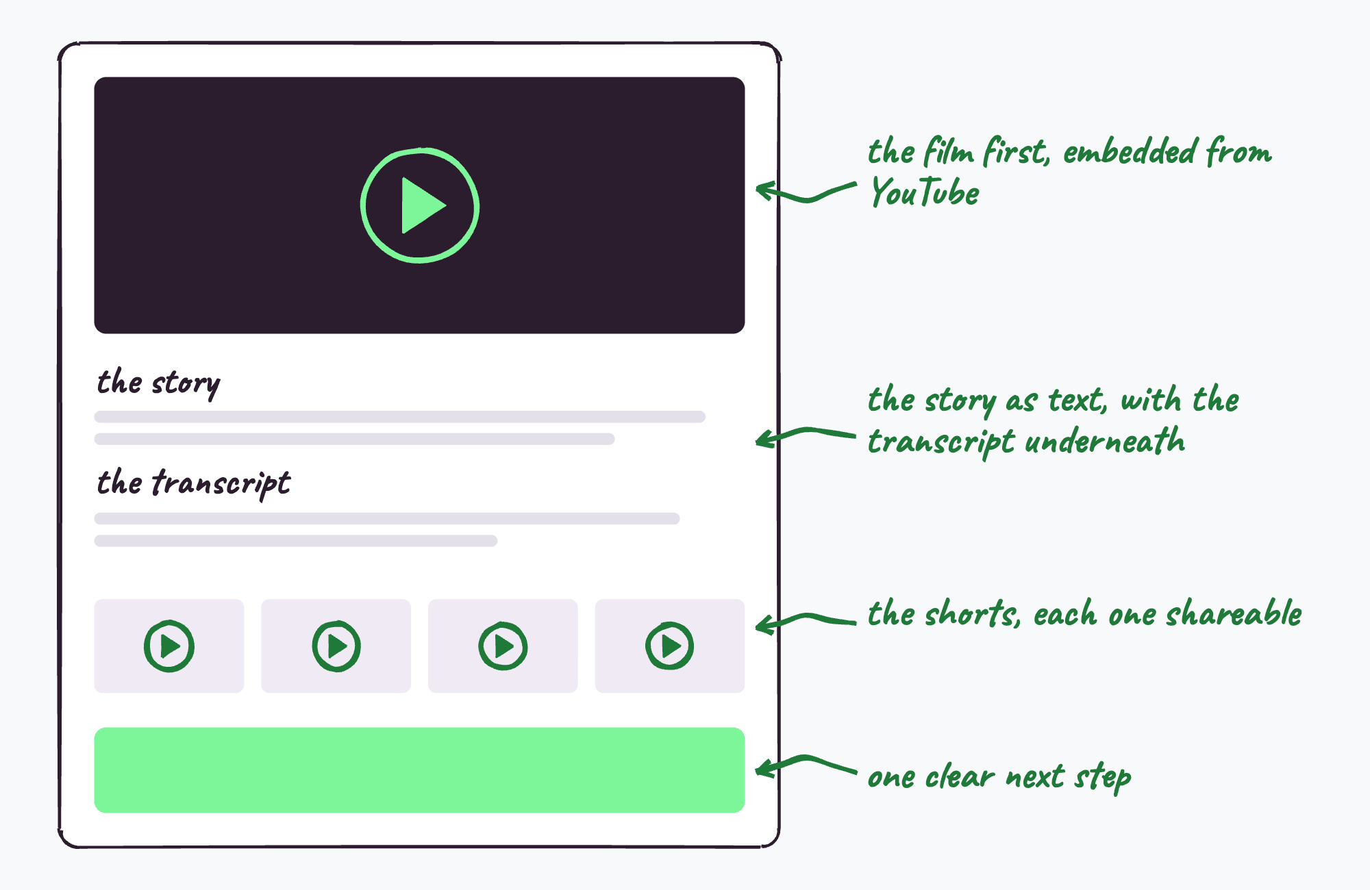
The whole story deserves a page of its own on your site: the film at the top, embedded from YouTube, then the written version, then the full transcript in plain text underneath. That page is what you link to from everywhere else, and the written version on it is what search engines and AI tools can read, because they can't watch the film.
7. Beyond the website
A few places that aren't web pages but work the same way:
- Proposals. Pick the quote by the prospect's industry rather than by service.
- Email signatures. A banner with a short quote, on every email your team sends, is the most frequently seen proof you have.
- Your careers page. A customer describing your team is quietly persuasive to someone deciding whether to join it.
- Google reviews. Ask the customer for a review in the same week as the interview, while they're feeling good about it.
How should each testimonial look?
Name, role and company on every quote. A bare quote in inverted commas, with no one attached, reads as something the marketing team wrote. This is the single most common mistake I see, and it's easy to fix.
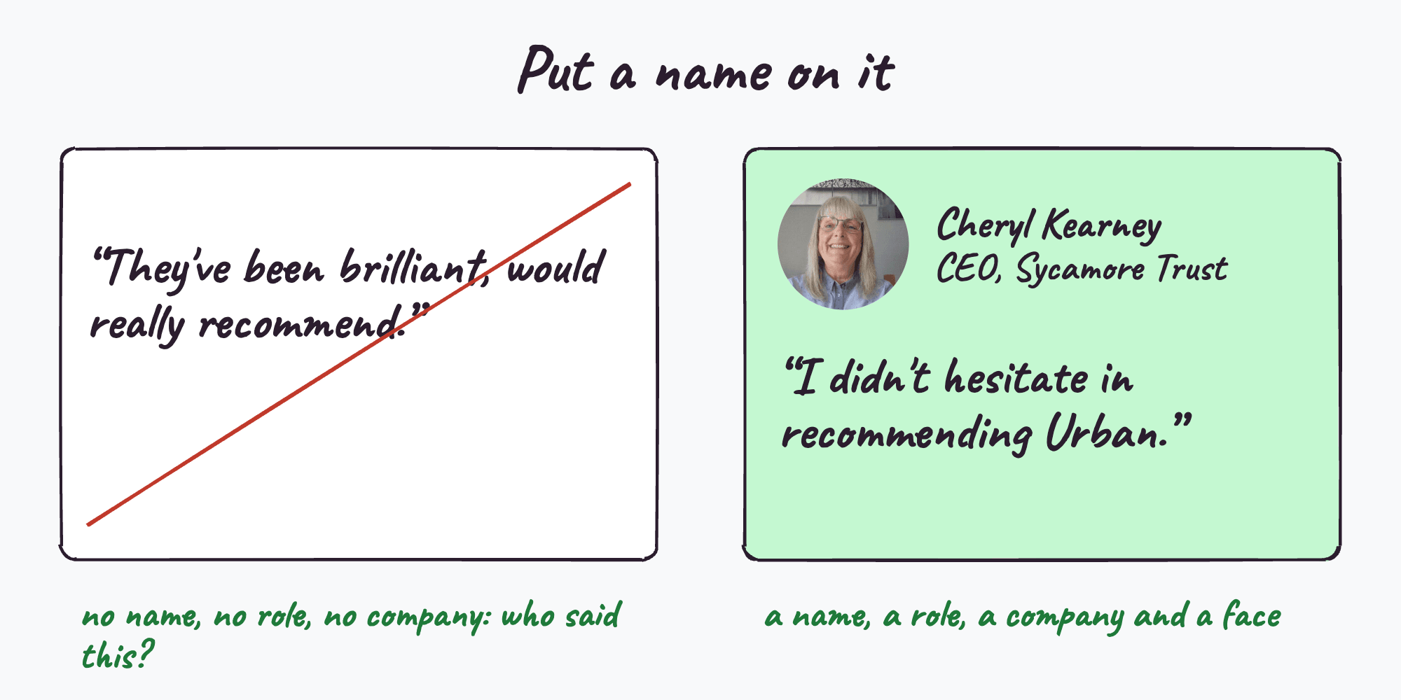
A face where you can. A small headshot or a still from the film makes a quote noticeably more believable than text alone.
One quote per page, chosen. A carousel of eight quotes on a service page gets ignored. One relevant quote, well placed, gets read.
The customer's actual words. Trim from the start or end if you need to, but don't rewrite what they said. A buyer can hear the difference between a person and a brochure.
When is a testimonials page still useful?
As an archive and a place to link to, it does no harm, and it's somewhere a prospect can go to see the breadth of who you work with. It just shouldn't be the only place your proof lives, and your best quote shouldn't be on it at the expense of the service page where it would change someone's mind.
Questions people ask
Where should testimonials go on a website?
On the pages where visitors decide whether to get in touch: service pages, next to the contact form, the homepage, the pricing page and sector pages, each with a quote that answers that page's question.
Should testimonials be above the fold?
There's no reliable evidence that position on the page matters more than relevance. Put the quote close to the decision the page asks for, whether that's near the top of a homepage or next to the form on a contact page.
How many testimonials should a page have?
Usually one, chosen for that page. A single relevant quote with a name and a face does more than a rotating carousel of general ones.
Should I host testimonial videos on YouTube or on my website?
Both. Upload the film to YouTube with captions and a full description, then embed it on a story page on your own site with the written story and transcript underneath, so people and search engines both find it.
Can I use the same testimonial on several pages?
Use different lines from the same story on different pages. One interview normally gives you a quote for a service page, one for the contact page and a verdict for the homepage.
Related reading
- Do testimonials help you get found in AI search?
- Why most MSP testimonials don't work
- Video testimonial vs written case study vs Google reviews
Every story we make comes with the placement decided: which line goes on which page, for which visitor, ready to paste in.
See what's in the packJames interviews MSP and tech vendor customers for a living and runs MSP Testimonials, the interview-led testimonial service. If a customer of yours has a story worth telling, this is how it gets told.